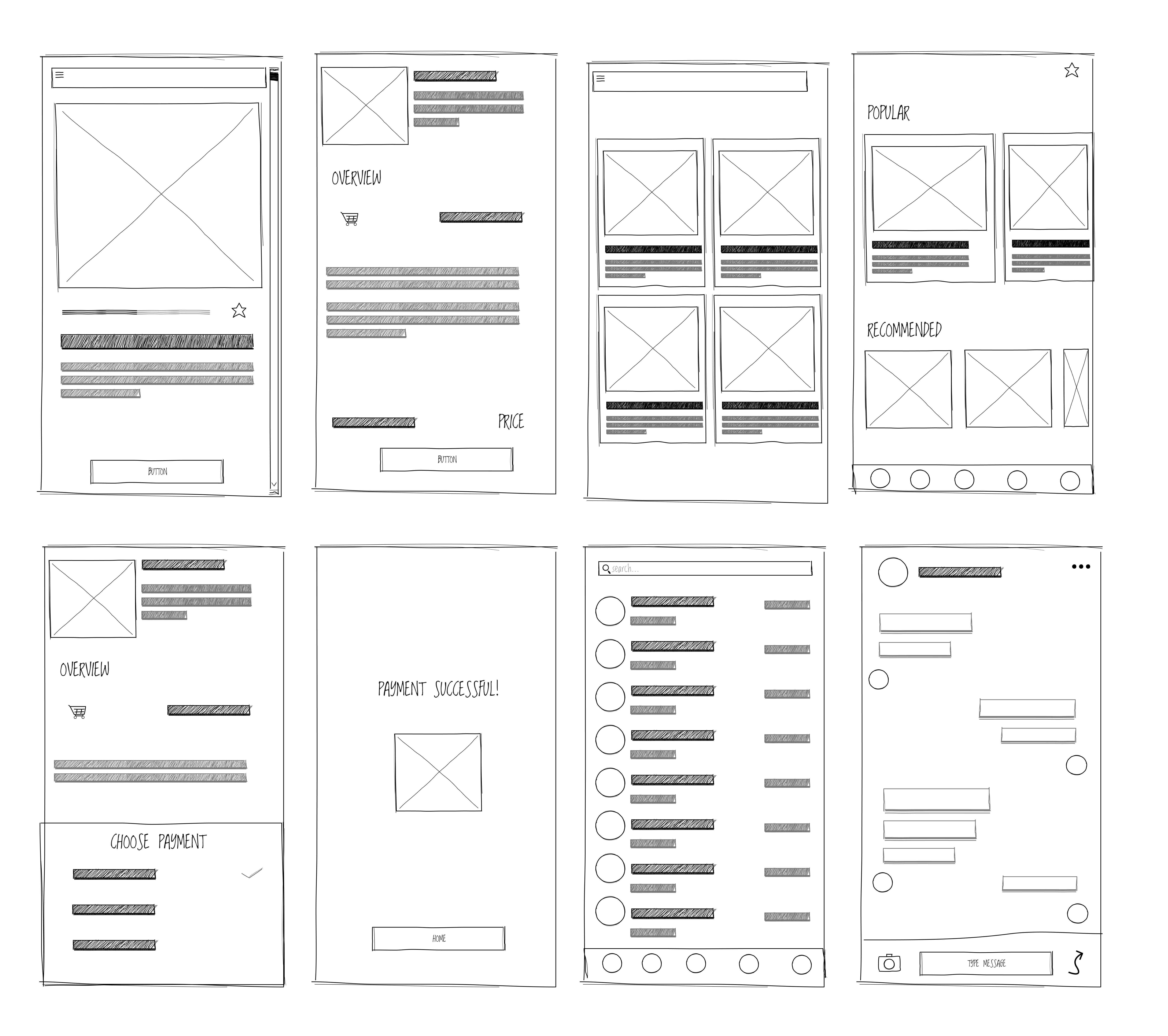
Creating a Design System from Scratch

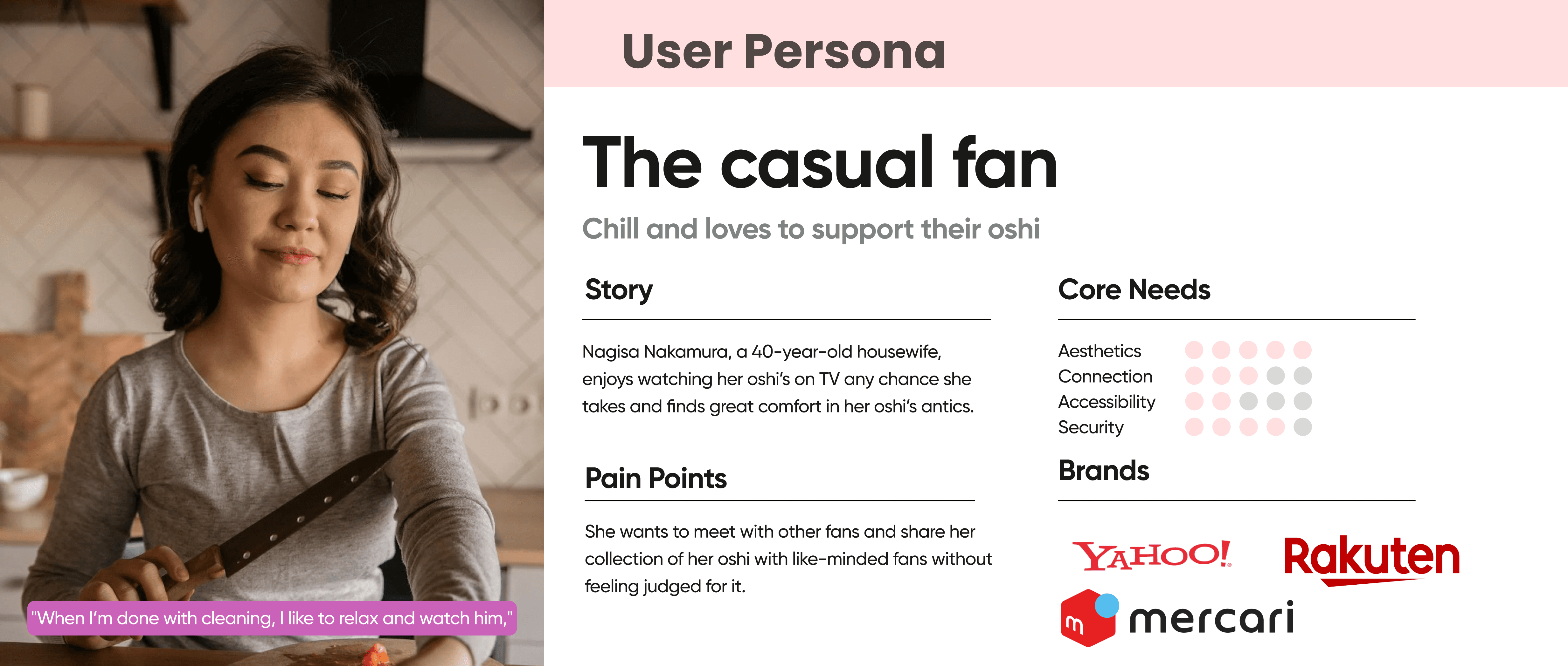
Fanflare is a mobile app that empowers fans to fund campaigns for billboard ads, birthday events, and charity projects while supporting independent artists like VTubers, cosplayers, and trainees. The app prioritizes transparent donations, fan engagement, and community interaction.

Defining Goals

To ensure the design solution aligned with both user needs and organizational objectives, I framed the project around three core goal categories.

Understanding the Problem

To better understand the landscape and identify opportunities, I conducted a competitive analysis of 8 applications across three distinct categories:

  • Fan Community & Social Networking Apps (e.g., Weverse, Amino)

  • Event & Schedule Tracking Tools (e.g., TimeTree, Meetup)

  • Fan Engagement & Niche Platforms (e.g., Patreon, Ko-fi)

    This research helped highlight best practices, feature gaps, and user experience patterns—especially around community interaction, event coordination, and creator support. These insights played a key role in shaping both the feature set and interaction model of the app.
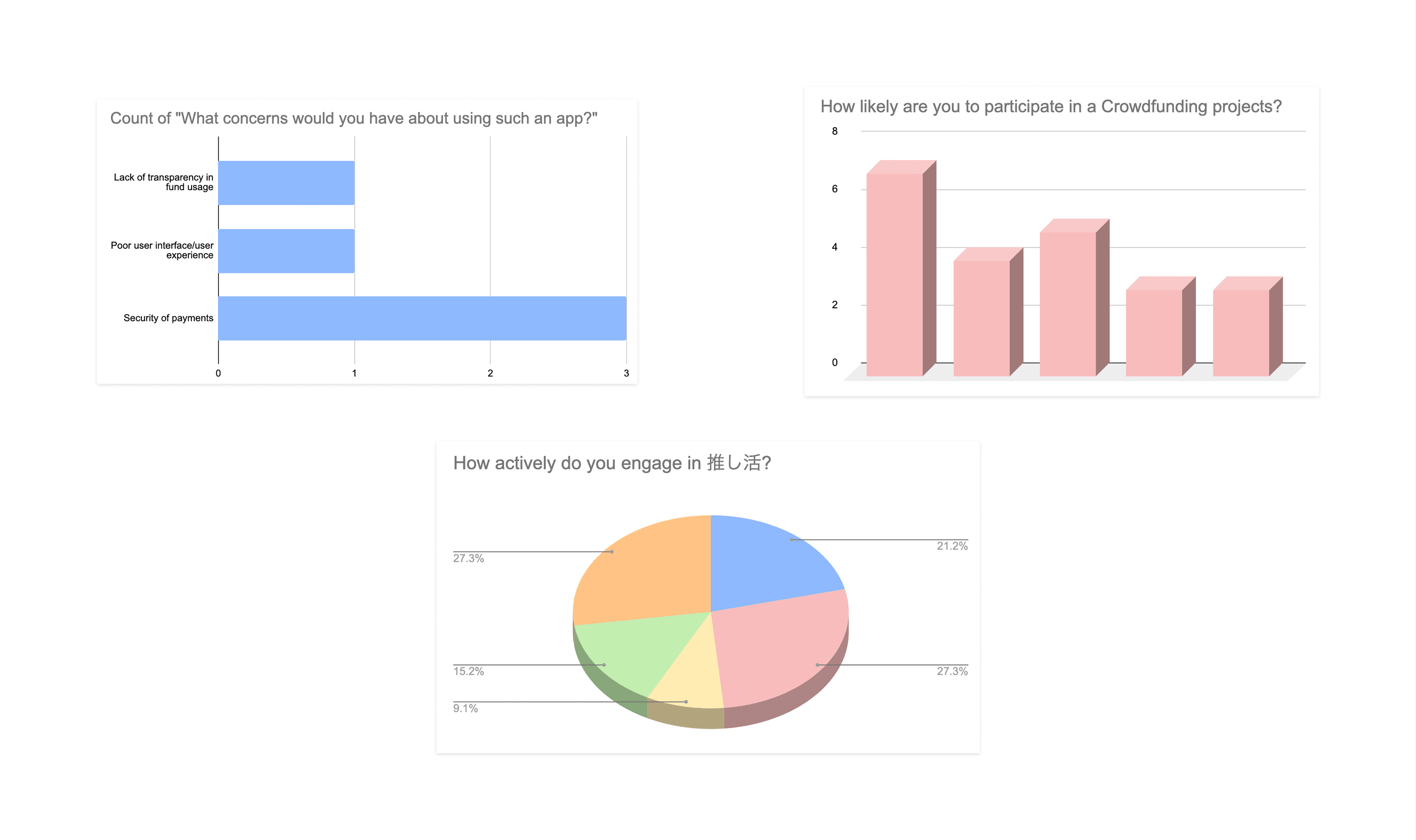
User Survey

I conducted user surveys and interviews with 12 fans from K-pop, VTubers, and cosplay communities to explore their needs around fan activities, crowdfunding, and fan apps.

Goals:

  1. Uncover pain points in current platforms.

  2. Understand how fans want to connect with their bias and each other.

Results:

92% rated transparent donation tracking as “very important.”

83% wanted rankings and badges for contributions.

75% struggled to find and join campaigns.

User Personas

To ensure the redesign reflected real user needs, I developed three detailed personas grounded in survey data, user interviews, and insights from our client and shopper communities.

These personas captured:

  • Key motivations

  • Pain points

  • Decision-making behaviors

    Providing a clear, human-centered foundation that guided content structure, feature prioritization, and the overall website experience.

Information Technology

To establish a clear structure for the app, I created a sitemap outlining all core user journeys, from onboarding to community features.

Userflow

I mapped out detailed user flows to validate key interactions and ensure a seamless experience.

Low-fidelity Mockup

I created low-fidelity mockups to quickly visualize how the app’s core experience comes together. I focused on key screens:homepage, crowdfunding confirmation page, and a short donation flow to test layout, hierarchy, and usability early on. These drafts helped validate the main interactions before moving into mid- and high-fidelity design.

Medium Fidelity

I developed medium-fidelity mockups to refine the structure and better illustrate the user experience with more detail and clarity. I focused on the homepage, crowdfunding confirmation page, and donation flow, incorporating feedback from the low-fidelity stage to improve hierarchy, interactions, and visual balance; bridging the gap between wireframes and polished UI.

Creating the Design System:

In developing the design system, I focused on creating a cohesive, flexible foundation that could scale across different features while feeling expressive and culturally relevant to the fandom space.

Inspired by feminine aesthetics and the deeply personal, emotional nature of fan culture, I embraced a visual language that celebrates softness, energy, and community pride. Rounded shapes, pastel tones, and delicate typography choices were intentional.

High-Fidelity Mockups

Key Improvements:

  • Design System Upgrade: Established consistent spacing, color palette, and typography scales. Components were restructured for reuse and accessibility

  • Visual Hierarchy: Improved readability by enhancing font pairing, card layout structure, and clear CTA placement.

  • Branding Consistency: Refined iconography and tone to better reflect the passion and energy of fan communities while staying user-friendly for a global audience.

Learnings

  • As I built the design system from the ground up, I learned to justify every choice—selecting colors that balanced brand personality with accessibility, choosing typography that improved hierarchy and readability, and defining spacing and components that created a calm, consistent rhythm throughout the app.

  • Designing the app end-to-end showed me the value of moving intentionally through each stage of the process. Taking time to research and wireframe helped me understand what users actually needed, allowing my later UI decisions to feel purposeful rather than decorative.

  • I discovered that the most impactful improvements often came from subtle refinements—tightening patterns, clarifying interactions, and aligning visuals with user insights—turning small decisions into a noticeably smoother, more cohesive experience.

More projects

Check out some of my favorite & most recent projects.

Create a free website with Framer, the website builder loved by startups, designers and agencies.